Due to a ransomware attack, the wiki was reverted to a July 2022 version. . We apologize for the lack of a more recent valid backup.
ToolbarService
ToolbarService is an Angular Factory in the Widget module with the name toolbar.js. It allows you to create a basic toolbar with controls and buttons. To use these functions, see the documentation on injecting Angular services.
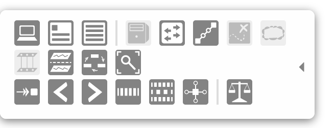
An example of a toolbar is on the Topology View.
| Name | Summary |
|---|---|
createToolbar | Create a toolbar basic toolbar. |
destroyToolbar | Destroy an already-created toolbar. |
Function Descriptions
createToolbar
Creates a toolbar panel that returns an API to add functionality to it.
| Example Usage | Arguments | Return Value |
|---|---|---|
var toolbar = tbs.createToolbar(id, opts); |
| an object with an API that contains actions that can be performed on the toolbar |
| Returned API Example Usage | Arguments | Return Value |
toolbar.addButton(id, gid, cb, tooltip); | This is a wrapper for ButtonService's button function. See the button service documentation for more information. | the button API object creates a button and adjusts the toolbar's width to accommodate it |
toolbar.addToggle(id, gid, initState, cb, tooltip); | This is a wrapper for ButtonService's toggle function. See the button service documentation for more information. | the toggle API object creates a toggle and adjusts the toolbar's width to accommodate it |
toolbar.addRadioSet(id, rset); | This is a wrapper for ButtonService's radioSet function. See the button service documentation for more information. | the radioSet API object creates a radio button set and adjusts the toolbar's width to accommodate it |
| toolbar.addSeparator(); | none | none creates a div styled to look like a line that separates buttons |
| toolbar.addRow(); | none |
creates a new row in which to add buttons – call if you want another row other than the first one |
toolbar.show(cb); | cb - (optional) a function reference to execute when the toolbar is done animating the "show" transition | none shows the toolbar |
toolbar.hide(cb); | cb - (optional) a function reference to execute when the toolbar is done animating the "hide" transition | none hides the toolbar |
toolbar.toggle(cb); | cb - (optional) a function reference to execute when the toolbar is done animating either the "show" or "hide" transition | none toggles the toolbar from shown to hidden or vice versa |
* The default settings for the toolbar are as follows:
defaultSettings = {
    edge: 'left',        // edge of the window the toolbar is on
    width: 20,           // default width of the toolbar with no buttons
    margin: 0,           // gap between the toolbar and the edge of the window
    hideMargin: -20,     // how much of the toolbar should be shown when the toolbar is hidden
    top: 'auto',         // 'top' CSS style for positioning
    bottom: '10px',      // 'bottom' CSS style for positioning
    fade: false,         // boolean of whether the toolbar will fade in and fade out
    shown: false         // boolean of whether the toolbar is shown initially
};
destroyToolbar
Destroys the created toolbar. Should be called on clean up.
| Example Usage | Arguments | Return Value |
|---|---|---|
tbs.destroyToolbar(id); | id - the string ID of the toolbar you want to destroy | none |